May 20, 2026
Find 1.7
Find 1.7 brought visual and layout changes across the site. These are design notes on what changed and the thinking behind it.
A summary of the changes:
- Home page: reorganized content around main tasks.
- Results page: new heading with result count, pagination moved to the bottom, compact filter labels, and field labels added to results.
- Advanced search page: a breadcrumb and a page lede for orientation.
- Styling: visual refinements for consistency.
Design approach
When making changes to Find, a few ideas shape our thinking. We want to share those so you have context for the "why" behind these changes.
Clarity
When an interface shows too many options or controls at once, it takes more work to find what you need. So we try to show what's useful for the task at hand rather than every possible option. This technique is called content layering: presenting information and options at the point of need, rather than all at once.
Consistency
Find is one of several tools our audience and staff use across Penn Libraries. When interfaces behave differently from one tool to the next, everyone has to relearn patterns, and it can feel like navigating separate organizations rather than one library.
We in Digital Library Development use our Design System to keep things predictable across our websites, so the way something works in Find matches how it works elsewhere. That includes applications we're redesigning, like Digital Collections (formerly Colenda), and ones we'll work on in the future. This is part of bringing our services together as one place.
Web accessibility standards are evolving to focus not just on technical requirements (like color contrast and keyboard navigation), but on making interfaces genuinely easier to understand and use, such as clear language and consistency. These changes aim to move Find in that direction.
The changes
Home page
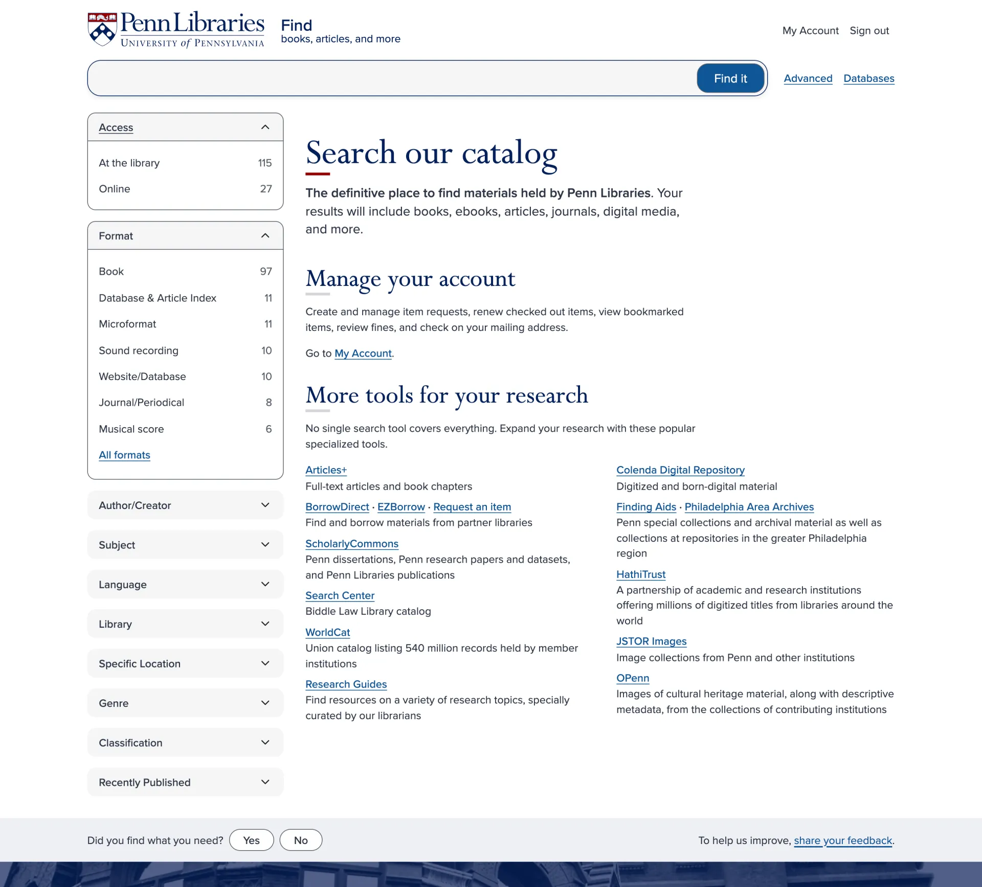
The home page is the first thing people see when they arrive at Find, and it's also what appears when someone clears a search. It's an opportunity to orient people to where they are and what they can do here.
We've reorganized content around the main tasks people come to Find to do: searching or finding materials, managing their account, and considering other research tools.
Previously, the page led with "What can I do here?" and "Where can I get help?", which are questions, not answers. The new headings ("Discover library materials," "Manage your account," "More tools for your research") tell you directly what you can do.
You might notice the "Where can I get help?" section is missing. Help has always been available consistently across the site, through our Chat pattern that floats on every page and through the contact us link in the Footer pattern. Help isn't a special feature of the Find home page. It's always available, consistently, on every Find page.
Results page
Heading
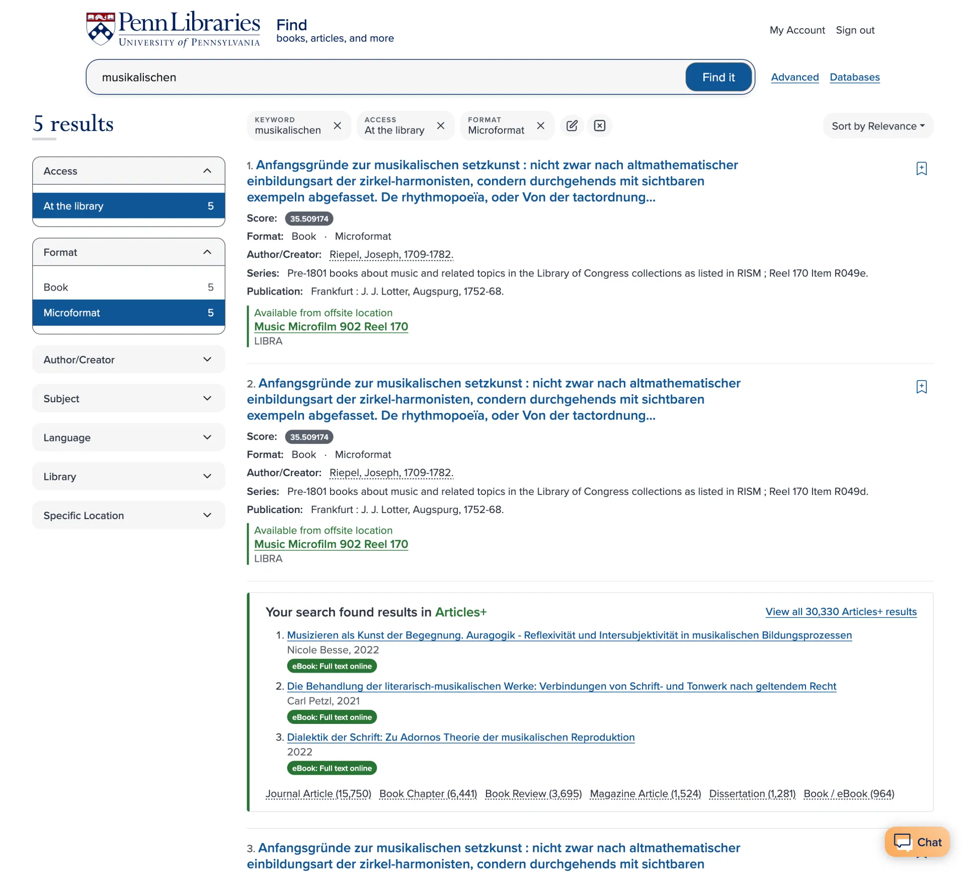
The results page now displays the result count as a visible heading (for example, "115 results") in the top left.
Previously, the page heading was visually hidden and just said "search," which wasn't as useful as we wanted it to be. Now the heading tells you exactly what you're looking at, and gives everyone the same clear starting point on the page.
Pagination
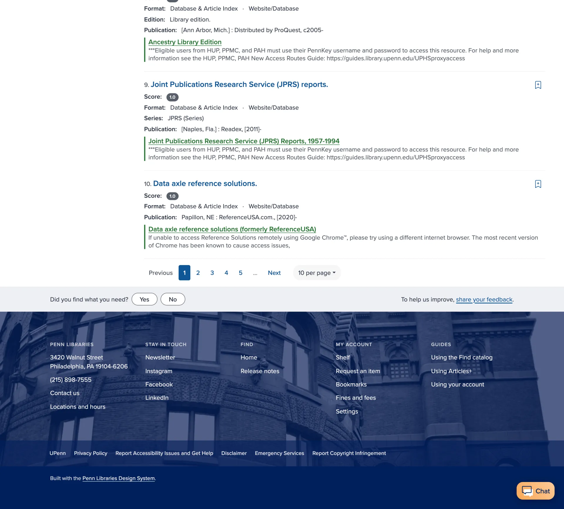
Pagination controls now appear only at the bottom of the results list, rather than at both the top and bottom.
When you land on a results page, you haven't seen the results yet, so page navigation at the top isn't a priority. Moving pagination to the bottom puts it where you need it, after you've reviewed the current results and are ready to move on.
Filters
In usability observations, filters are something users constantly overlook, often treating them as visual noise to tune out rather than something to engage with. By compacting how active filters display, we hope to help people notice them, understand the current state of their search, and feel more in control of the results they're seeing.
Result field labels
Each result now shows explicit labels for metadata like Format and Author/Creator.
Previously, this information appeared but without clear labels. You had to infer what each line meant based on its position or formatting. Adding labels reduces that ambiguity. We believe this will make it easier to scan results, particularly for people less familiar with the catalog.
Advanced search page
We added a breadcrumb for navigation and orientation to the site hierarchy. There's now a page lede to introduce the purpose and concept of an advanced search.
Other visual updates
You may notice other small styling changes, such as updated spacing, typography, and visual refinements. These bring Find in line with our Design System and improve overall consistency.